
Creating a landing page with scrollable sunset and waves by inserting code in markup editor for a page.
From Sunset Waves Scroll made by Giedre Ju
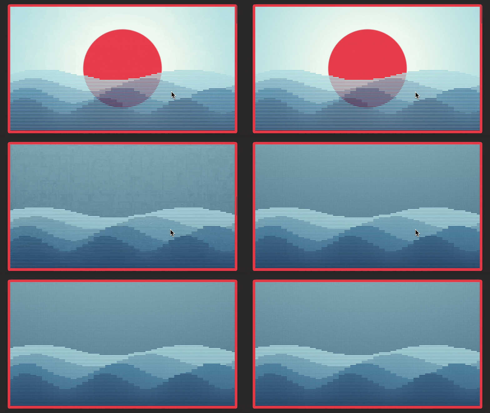
Creating a page
Steps in video
- Create page
- Change to HTML editor
- Upload page image
- Go to Codepen and open code
- Copy HTML code from codepen
- Paste the HTML code in the editor
- Copy CSS code in codepen
- Create
<style>tags and add the CSS code between the tags - Change the template to landing (name is theme dependent)
- Go to preview
Changing colors
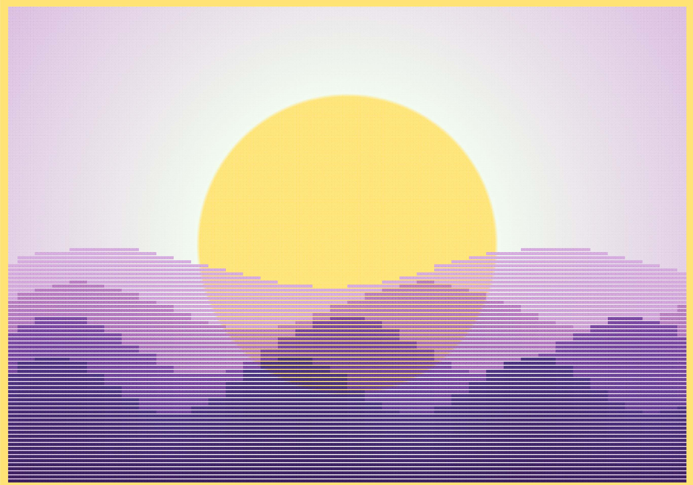
Colors are defined in the beginning of the CSS code with variables.
:root {
  --punch-red: #e63946;
  --honeydew: #f1faee;
  --frosted-blue: #a8dadc;
  --pacific-blue: #77abbd;
  --cerulean: #457b9d;
  --baltic-blue: #31587a;
  --oxford-navy: #1d3557;
}
Content box
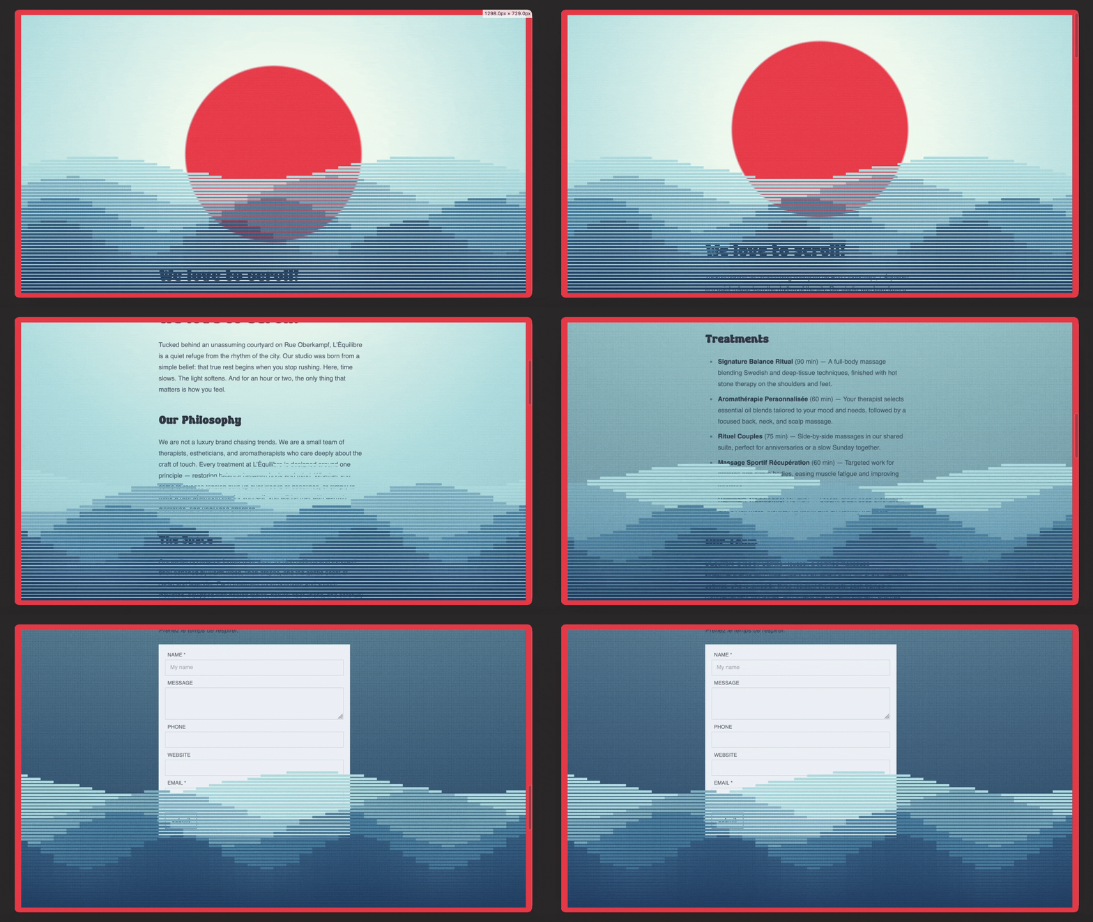
As a webpage usually contains more information it is useful to add in a box for content which scrolls up with the sun.
The content is added after the <section class="content"> tags in the code below.
<section class="sunset-section">
<section class="content">
    <h1>We love to scroll!</h1>
</section>
<div class="wave w1">
  <i></i><i></i><i></i><i></i><i></i><i></i><i></i><i></i><i></i><i></i>
  <i></i><i></i><i></i><i></i><i></i><i></i><i></i><i></i><i></i><i></i>
  <i></i><i></i><i></i><i></i><i></i><i></i><i></i><i></i><i></i><i></i>
  <i></i><i></i><i></i><i></i><i></i><i></i><i></i><i></i><i></i><i></i>
</div>
<div class="wave w2">
  <i></i><i></i><i></i><i></i><i></i><i></i><i></i><i></i><i></i><i></i>
  <i></i><i></i><i></i><i></i><i></i><i></i><i></i><i></i><i></i><i></i>
  <i></i><i></i><i></i><i></i><i></i><i></i><i></i><i></i><i></i><i></i>
  <i></i><i></i><i></i><i></i><i></i><i></i><i></i><i></i><i></i><i></i>
</div>
<div class="wave w3">
  <i></i><i></i><i></i><i></i><i></i><i></i><i></i><i></i><i></i><i></i>
  <i></i><i></i><i></i><i></i><i></i><i></i><i></i><i></i><i></i><i></i>
  <i></i><i></i><i></i><i></i><i></i><i></i><i></i><i></i><i></i><i></i>
  <i></i><i></i><i></i><i></i><i></i><i></i><i></i><i></i><i></i><i></i>
</div>
<div class="wave w4">
  <i></i><i></i><i></i><i></i><i></i><i></i><i></i><i></i><i></i><i></i>
  <i></i><i></i><i></i><i></i><i></i><i></i><i></i><i></i><i></i><i></i>
  <i></i><i></i><i></i><i></i><i></i><i></i><i></i><i></i><i></i><i></i>
  <i></i><i></i><i></i><i></i><i></i><i></i><i></i><i></i><i></i><i></i>
</div>
</section>
<style>
:root {
  --punch-red: #e63946;
  --honeydew: #f1faee;
  --frosted-blue: #a8dadc;
  --pacific-blue: #77abbd;
  --cerulean: #457b9d;
  --baltic-blue: #31587a;
  --oxford-navy: #1d3557;
}

@property --a   { syntax: "<angle>";  inherits: true;  initial-value: 0deg; }
@property --amp { syntax: "<number>"; inherits: false; initial-value: 1; }
@property --off { syntax: "<angle>";  inherits: false; initial-value: 0deg; }

html { background: var(--punch-red); }

html::after {
  content: "";
  position: fixed;
  inset: 0;
  z-index: 100;
  pointer-events: none;
  border: 16px solid var(--punch-red);
}

.content {
    position: absolute;
    top: 50vh;
    left: calc(50vw - 15rem);
    padding: 2rem;
    width: 30rem;
    margin: 0 auto;
}

.sunset-section {
  margin: 0;
  height: 600vh;
  background: radial-gradient(
    circle 500vh at 50% 50vh,
    var(--punch-red) 0 30vh,
    var(--honeydew) 30.7vh,
    var(--frosted-blue) 100vh,
    var(--oxford-navy) 400vh
  );
  position: relative;
}

.sunset-section::after {
  content: "";
  position: fixed;
  inset: 0;
  z-index: 16;
  pointer-events: none;
  mix-blend-mode: overlay;
  opacity: 0.35;

  background-image:
    radial-gradient(rgb(255 255 255 / 0.9) 0.6px, transparent 0.9px),
    radial-gradient(rgb(255 255 255 / 0.7) 0.5px, transparent 0.8px),
    radial-gradient(rgb(0 0 0 / 0.8) 0.6px, transparent 0.9px),
    radial-gradient(rgb(0 0 0 / 0.6) 0.5px, transparent 0.8px);

  background-size: 3px 3px, 5px 5px, 7px 7px, 11px 11px;

  background-position:
    random(0px, 3px) random(0px, 3px),
    random(0px, 5px) random(0px, 5px),
    random(0px, 7px) random(0px, 7px),
    random(0px, 11px) random(0px, 11px);
}

.wave {
  position: fixed;
  inset: auto 0 0 0;
  height: 70vh;
  display: flex;
  align-items: flex-end;
  animation: roll linear both;
  animation-timeline: scroll(root);
}

@keyframes roll {
  to { --a: 720deg; }
}

.w1 { z-index: 1; --base: 46vh; --swing: 4vh; --speed: 1;  --step: 14deg; --c1: var(--frosted-blue); --c2: var(--pacific-blue); }
.w2 { z-index: 2; --base: 38vh; --swing: 5vh; --speed: -1; --step: 18deg; --c1: var(--pacific-blue); --c2: var(--cerulean); }
.w3 { z-index: 3; --base: 30vh; --swing: 6vh; --speed: 2;  --step: 22deg; --c1: var(--cerulean);     --c2: var(--baltic-blue); }
.w4 { z-index: 4; --base: 22vh; --swing: 6vh; --speed: -2; --step: 26deg; --c1: var(--baltic-blue);  --c2: var(--oxford-navy); }

.wave i {
  --px: 8px;
  --amp: random(0.5, 0.9);
  --off: random(-5deg, 5deg);

  flex: 1;
  height: round(
    down,
    calc(
      var(--base) +
      sin(calc(var(--a) * var(--speed) + sibling-index() * var(--step) + var(--off)))
      * var(--swing) * var(--amp)
    ),
    var(--px)
  );

  background: linear-gradient(var(--c1), var(--c2));

  -webkit-mask-image: repeating-linear-gradient(
    0deg, #000 0 calc(var(--px) - 2px), transparent 0 var(--px)
  );
  mask-image: repeating-linear-gradient(
    0deg, #000 0 calc(var(--px) - 2px), transparent 0 var(--px)
  );
}
</style>
Form
Add a form created use the !render tag
{% form 'contact' success:'Thank you for contacting us!' error:'Form contains errors!'%}{% endform %}