
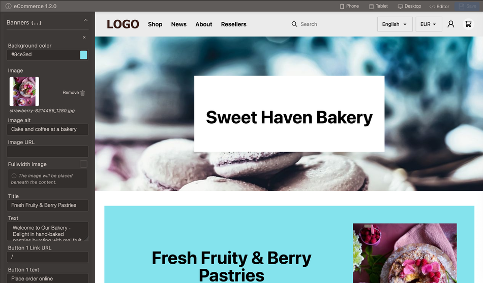
Default theme for eCommerce installations.
- Over 30 pre-defined color themes and custom font upload
- Translations support
- Language, currency switchers
- Search box
- B2C and B2B adaptions in checkout
- Withdraw order functionality
- Template for easy landing page imports
If you already have the theme in your store you can easily update it through admin otherwise you can upload the theme from github: eCommerce theme on github
All themes have settings for adapting, colors, layout and elements such as the header, footer and first page but they will vary depending on the theme. The code for the themes can be modified and as well as created from scratch.
Global settings
- Settings for radius and shadows
- Fonts
- Legal pages
- Custom CSS- and JS-files
- Development setting
Radius and shadows
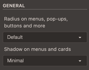
The radius can be adjusted for three levels (minimum, medium, maximum) or none. The default value is set to follow the presets chosen under Colors.
The shadow setting adds a shadow on menus and cards.
Fonts
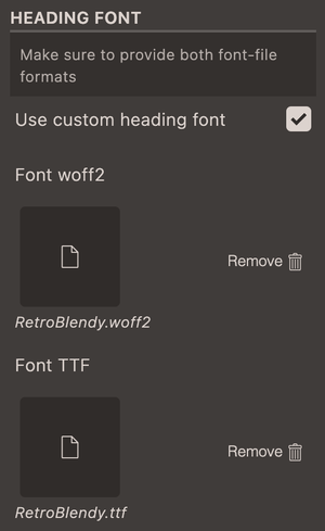
A custom font can be used for the headings on the website. The theme supports woff and ttf formats and both formats should be uploaded.
Resources
- Fonts can be found in Dafont, Font library, and Google fonts.
- Generating additional fonts-file formats: Font transformer
- More about typography : Web typography for non-designers
How to build with theme settings: Tutorial on how to work with fonts as asset uploads
Add custom font for headings in theme settings.
Steps in video
- In theme settings go to Global settings
- Find a font and create .ttf and .woff2 formats
- Upload the font-files in theme settings and enable them with the checkbox for custom font.
Legal pages
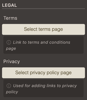
Settings for adding in pages for Terms and conditions and Privacy policy. Links to these pages are used in checkout.
Color themes
The theme has over 30 color themes to choose from. They are chosen in a drop-down and provides an easy way to adapt to the brand colors as well as change color scheme when needed.
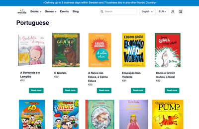
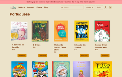
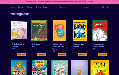
Header
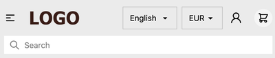
The fully responsive header includes support for logo, navigation, autosearch, language selector, currency selector, account button, and cart button.
| Name | Description |
|---|---|
| Logo | The theme uses logos added in Site settings |
| Navigation | Build navigation under Navigation |
| Autosearch | Uses the built-in search functionality in Cradle |
| Language selector | Shown if more than one language is published under Languages |
| Currency selector | Shown if there are more than one currency active in Shop settings |
| Customer accounts link | Toggle on and off in theme settings |
| Cart | Drawer cart or redirect as options |
A note for theme developers: Autosearch, language selector, currency selectors and many more are written as stand-alone components and can be found in Github cradle-component

Homepage
Hero section
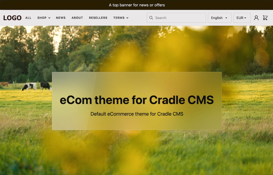
An optional hero section with adjustable height, background image or video and A card with title, description, image, and button.
Top grid and bottom grid
Below the hero box as well as over the footer it is possible to add a grid row.
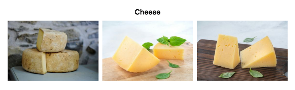
Banners
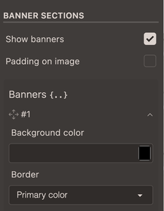
- Background color picker and border settings
- Text block with title, descriptive text, link button and add to cart button.
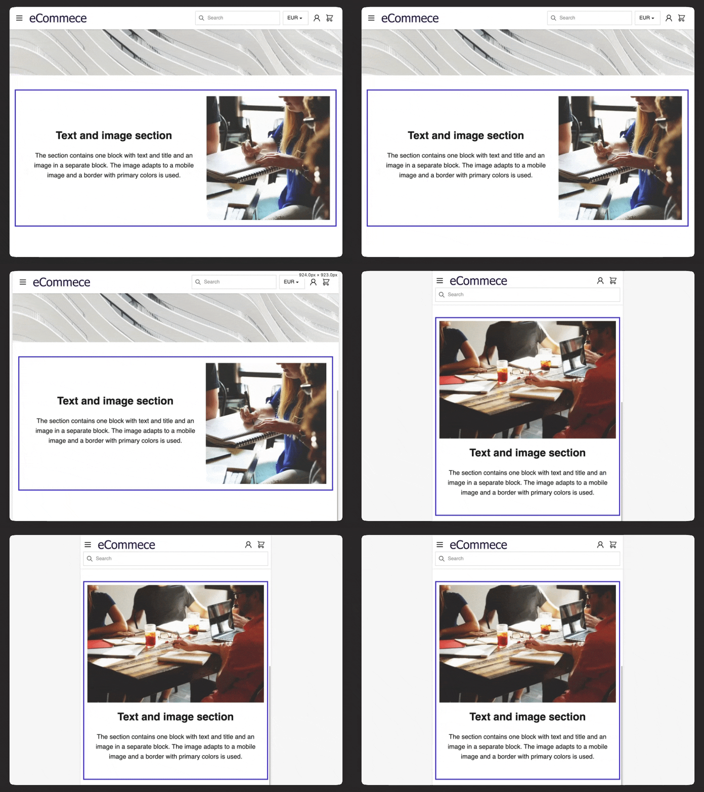
- Image block displayed next to the text block or when in full-width over the block.
- Collection row
| Theme settings | Banner |
|---|---|
 |
 |
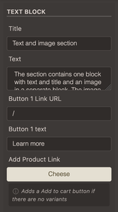
Text block
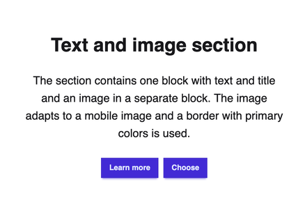
The text block can contain title, text, a link button and add to cart for a product.
| Textblock settings | View of textblock |
|---|---|
 |
 |
Image
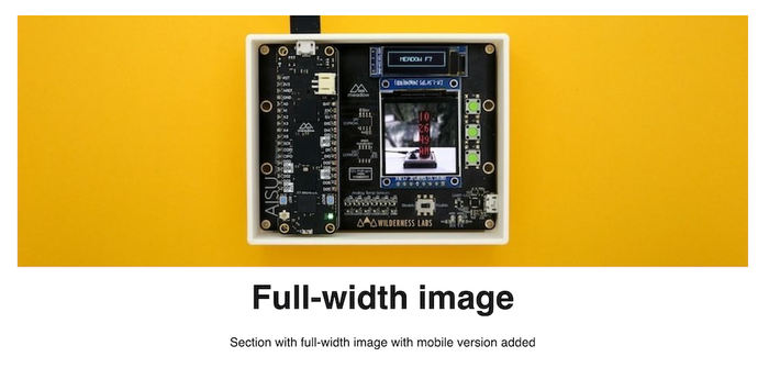
An image can be added to the banner.
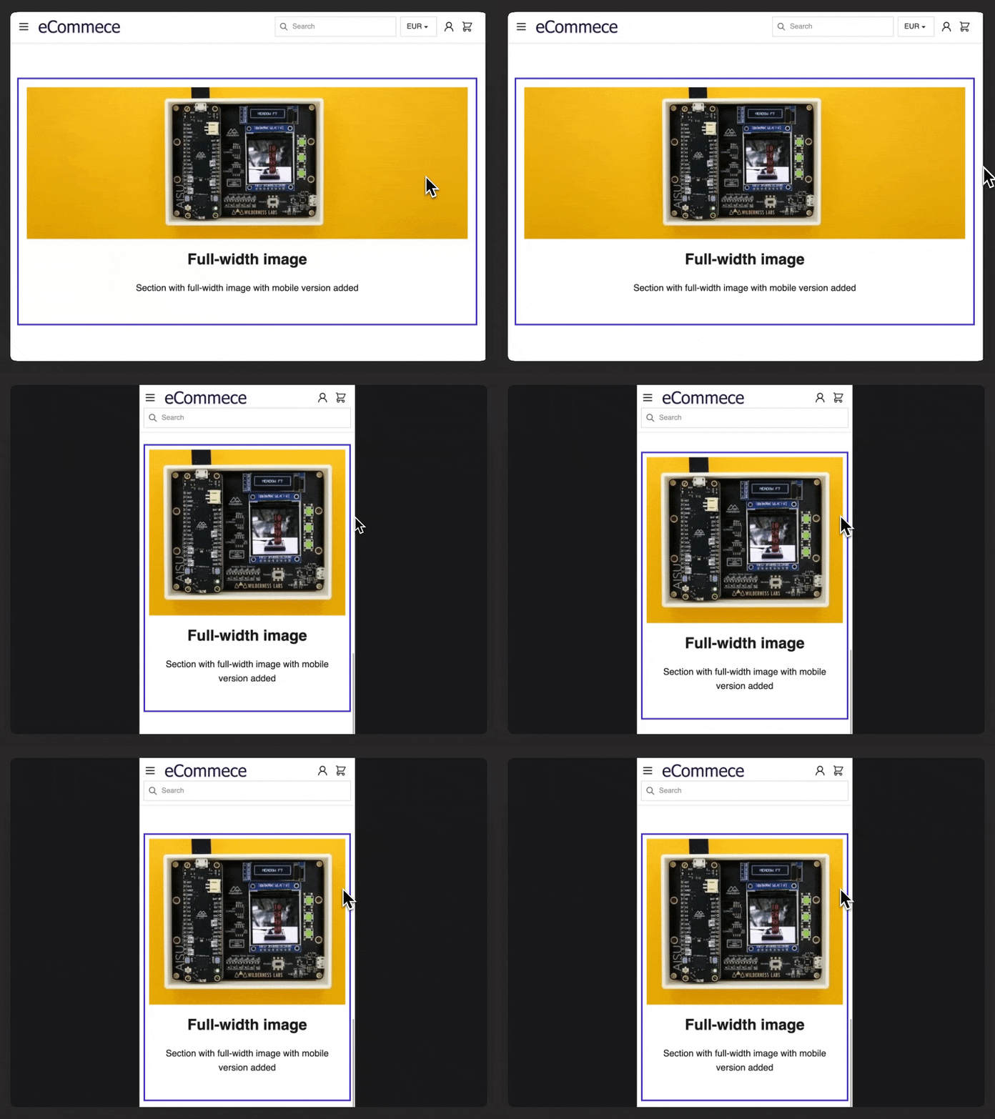
- Full-width option.
- Optional mobile version.
- Possible to wrap in a link
The optional mobile version allows using different formats for the image in desktop and mobile.
| Block | Full-width |
|---|---|
 |
 |
Collection row
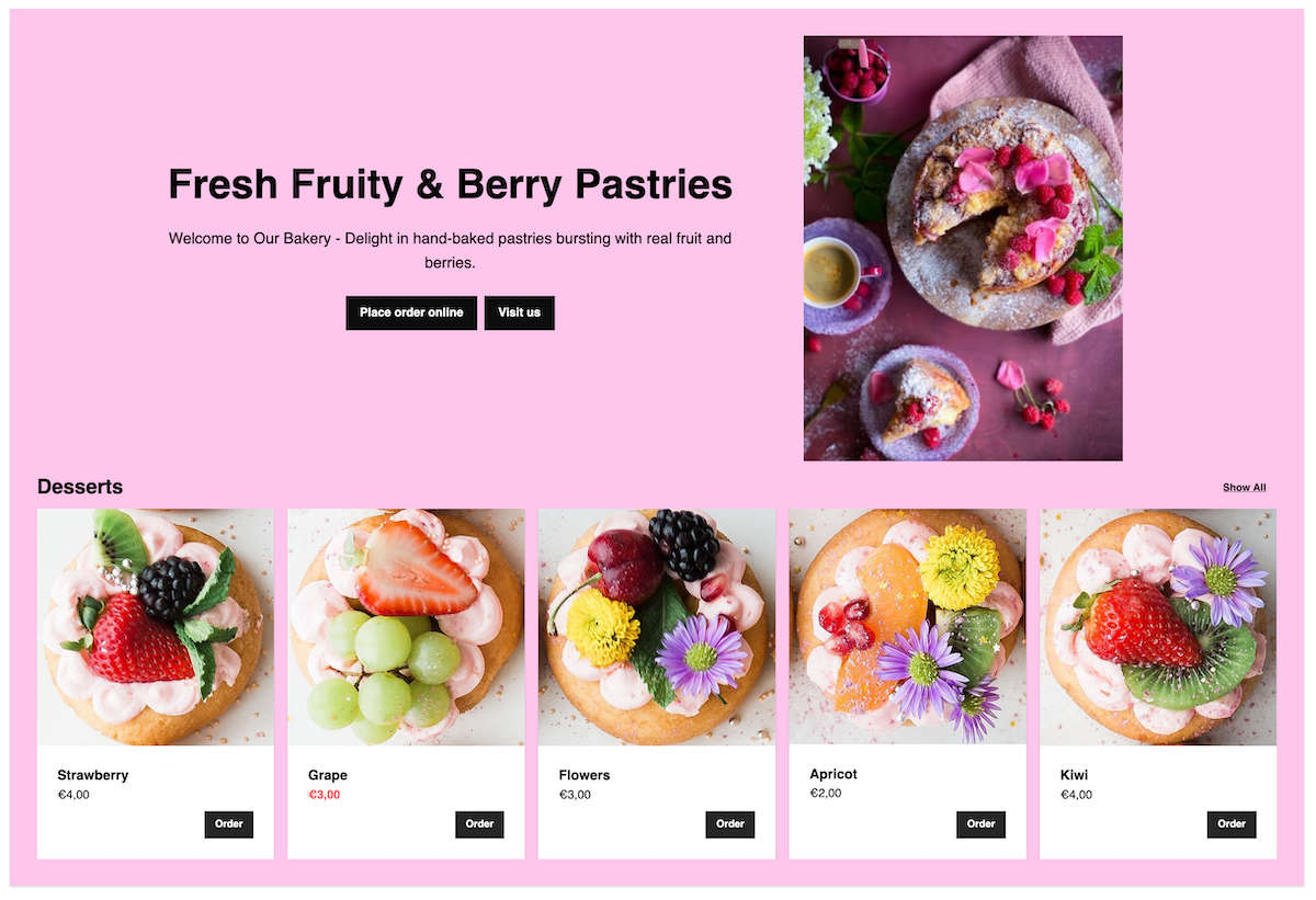
Add a row of products by choosing collection.
Pages
The theme contains several templates, these are chosen in the admin view for the page.
Adding the tag
!renderwill enable the usage of liquid syntax in the page editors.
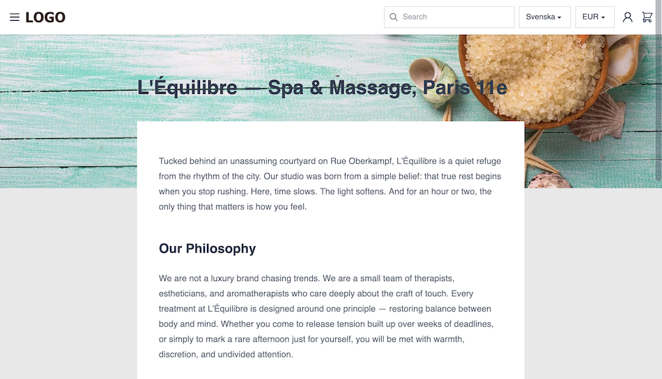
Default page settings
| Setting | Description |
|---|---|
| Text alignment | Text alignment: left, center or right |
| Page width | Choose from narrow to full width |
Additional templates
- Contact template : Adds a form chosen in theme settings
- Landing-page template : Completely empty body but includes content to the head. Option to include site header and footer in landing pages.
- Layout-free template : No layout file is used, suitable when adding a standalone landingpage.
Footer
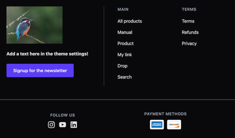
The footer is built to adapt to the provided information.
- Logo or image
- Descriptive text
- Custom button
- Navigation link lists
- Social media links
- Payment methods
Checkout
- Country selectbox A country picker in the top displays the country ordering from if purchases can be done from more than one country.
- Shipping picker If the cart contains shippable items the applicable shippings will be displayed,
- Customer details Minimal amount of customer detail fields are displayed. If the customer is logged in the values are prefilled.
B2B and B2C
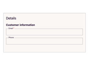
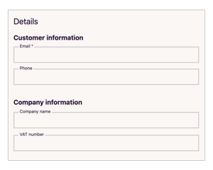
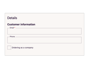
The theme is adapted to business to consumer, B2C, and business to business ,B2B, settings.
| Setting | Description |
|---|---|
| None | Similar to B2C |
| B2C | A minimal amount of customer information |
| B2B | Additional B2B fields added |
| B2C and B2B | Adapted to serve both segments at the same time, business fields are opened with a toggl |
B2C and B2C settings can be found under Shop settings
Theme customizations
There is full access to the theme code in the theme editor, but altering the theme makes updates harder to follow.
Include custom script file
Add in scripts, commonly needed when using 3rd party tools, and still be able to use the update function.
- Go to theme files editor and add in a file in assets called
custom.js - Add the code into the file, remove any
<script>tags, remember to look for the closing tag as well</script>. - Go to theme settings > global and tick include custom script file
Include custom meta data
- Go to theme files editor and add in a file in assets called
customMeta.liquid - Add the meta data into the file.
- Go to theme settings > global and tick include custom meta file