The built-in form builder enables the creation and management of forms, including contact forms and newsletter sign-ups. All form submissions are validated server-side before being saved in the database. The generated forms can be added with optional HTML-code generation and with multiple forms on the same page.
- Secure data
The form submissions are stored on your server and make it easy to adhere to GDPR and other privacy laws. - Server-side data validation
Form submissions are validated before being saved in the database to prevent attacks, errors, and maintain data integrity. - Unlimited forms
This is a self-hosted solution: no limit on the amount of forms and form submissions. - Email notifications
Set up email notification when receiving a form submission. - Auto HTML generation
Optional HTML-code generation for easy setup of forms. - Multiple forms on pages
Multiple forms, such as a contact form as well as a newsletter signup, can be setup on the same page. - JS free
Forms work without JS. - Code freedom
Customize form HTML and CSS freely. - Connect to other services
Send form submissions to other services with webhooks. - Translations
All form fields and messages can be translated in Language > Translations (found under form context).
The forms can be used in JS-free sites as they do not require JS to function.
Form entries
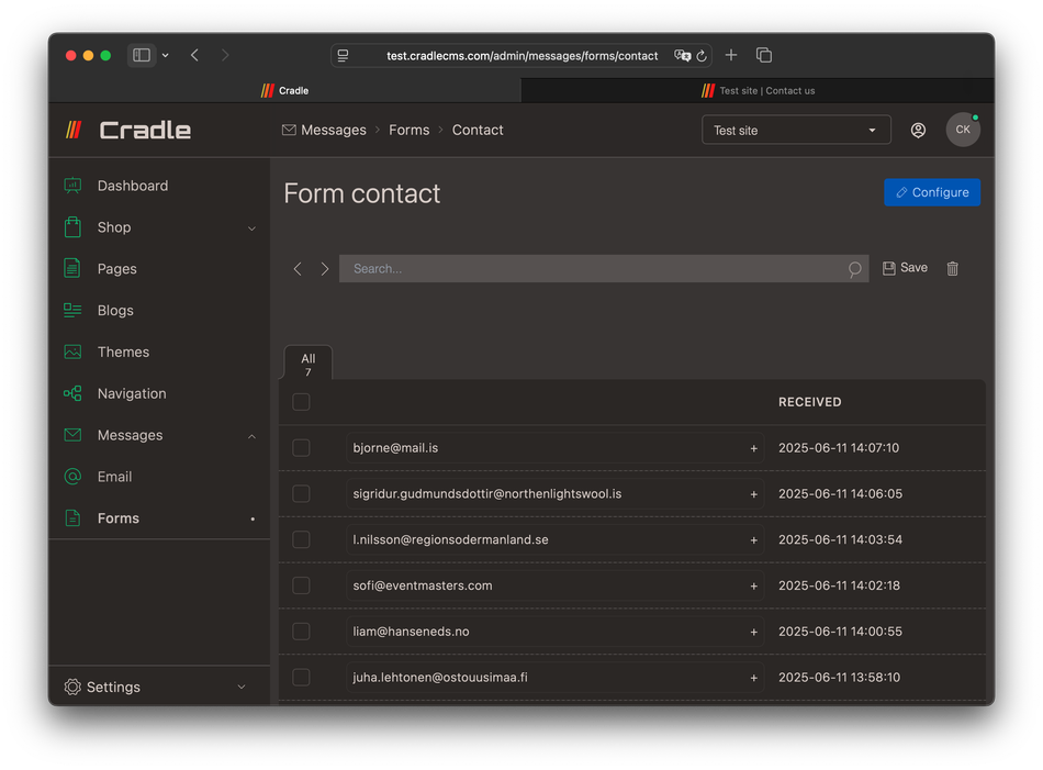
Form submissions are validated server-side before being saved.
Add new form
Forms and creating a new form.- Navigate to
Forms, found underMessagesin the left-side menu. - Press
Create formand give a handle for the form. The handle is used as the form name and identifier when including on the site.
Form actions
Three values are possible: No action, Forward to email, and Newletter signup.
| Action | Description |
|---|---|
| No action | The form entries are saved but no further actions are taken. |
| Forward to email | A copy of the form entry is also sent to the email specified under Messages > Email |
| Newsletter signup | A customer is created in the system. |
Set up form fields
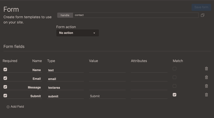
Fields are added in admin with a no-code builder. Forms are added and modified under Messages; also form submissions can be found here.
Form fields consist of Name, Type, Required, Match, Attributes, and Value. Each input field that the form will consist of needs to be specified in the admin, this is part of the form validation.
| Option | Description |
|---|---|
| Required | Form submissions are only accepted if containing this field. required will be added into the form field. HTML code should reflect this with the required attribute for the best UX experience. |
| Name | The name of the form field, used in the label and as HTML attribute name="email" for the input field. |
| Type | Type of HTML input field for example type="email". |
| Value | Sets a value on the input field. |
| Attributes | Adds input attributes for the generated HTML code. |
| Match | The given value has to match in the form submission, this can be used to create a validation to detect human users. |
Attributes
Attributes are specified as they are written in the HTML field with a space in-between. For example, for a text-field it is common to specify a placeholder placeholder="My name", or minimum and maximum values such as the starting date min="2025-10-07".
| Attribute name | Description | Example |
|---|---|---|
| disabled | Indicates an disabled field | disabled |
| class | Adds a CSS class to the element | class="btn" |
Mdn docs provides more information on how attributes are used in input fields.
Input types, select box, and textarea
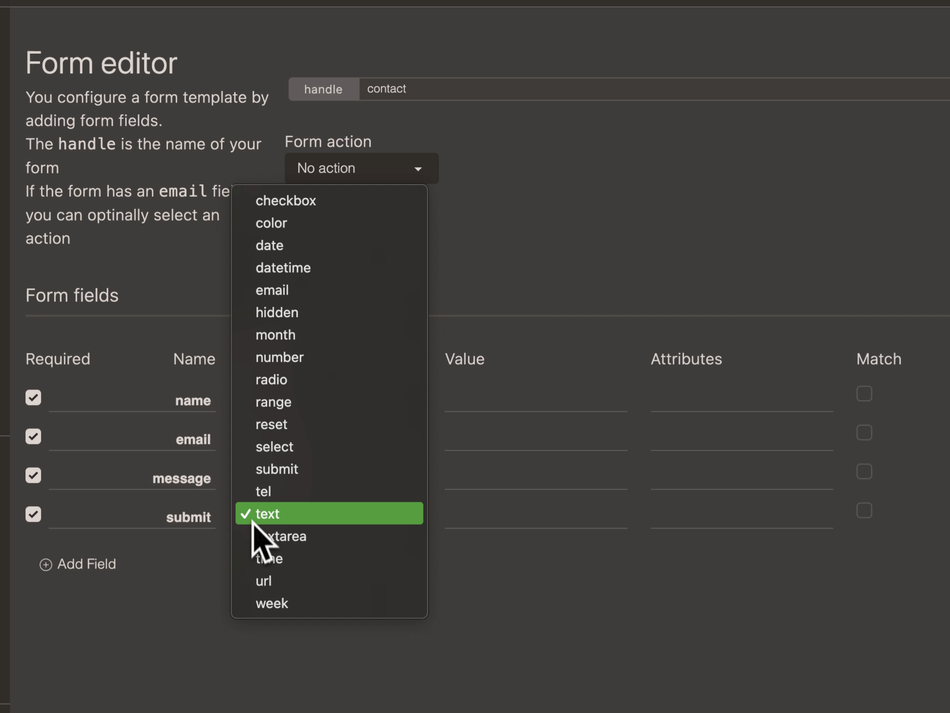
There is support for input types text, number, email, tel, url, color, date, datetime, month, week, time, range, hidden, reset and submit, as well as textarea and select.
All browsers will display the types in slightly different ways, and it is possible to add in your own styling with CSS to override the default browser styles - Webdev guide for forms.
| Name | Description |
|---|---|
| Checkbox | A square box that can be ticked. |
| Color | Displays a color picker. |
| Date | For specifying dates. |
| Datetime | For specifying date in combination with time. |
| Similar to a text input field but used for email-address insertions. | |
| Hidden | A way to add in meta data for the form entry. |
| Month | For specifying a month. |
| Number | Allows the user to specify a number. |
| Paragraph | A free text paragraph. |
| Radio | A radio button, usually added in a groups |
| Range | Choosing a value from a range. |
| Reset | A reset button for the form. |
| Select | Creates a select box. |
| Submit | A submit button for the form. |
| Time | For specifying a time. |
| Tel or phone | An input field for phone numbers. |
| Text | Is used for a single line of text, usually a name. |
| Textarea | Most commonly used to write a message. |
| URL | Input field for website addresses. |
| Week | For specifying a week. |
| Label | Label tag that can be used for input groups. |
More information about input types
<input>: The HTML Input element
Checkbox
| Required | Name | Type | Value | Attributes | Match |
|---|---|---|---|---|---|
| Yes | Policy | Checkbox | I consent to having this website store my submitted information so they can respond to my inquiry. See our privacy policy to learn more about how we protect and manage your submitted data. | - | - |
		<label>
			<input type="checkbox" value="I consent to having this website store my submitted information so they can respond to my inquiry. See our privacy policy to learn more about how we protect and manage your submitted data." name="policy" required="">
			I consent to having this website store my submitted information so they can respond to my inquiry. See our privacy policy to learn more about how we protect and manage your submitted data.
  </label>
Colorpicker
| Required | Name | Type | Value | Attributes | Match |
|---|---|---|---|---|---|
| - | Colorpicker | Color | - | - | - |
<label for="Colorpicker">Colorpicker</label>
<input type="color" name="Colorpicker">
Date and times
Date
| Attributes | Description | Example |
|---|---|---|
| Value | Specify a preselected value. | value="2025-10-12" |
| Min | Start date from where dates can be selected | min="2025-10-07" |
| Max | Last date from where dates can be selected | max="2025-10-25" |
Datetime
Note that the type in HTML is
datetime-local
| Attributes | Description | Example |
|---|---|---|
| Value | Specify a preselected value. | value="2025-06-12T19:30" |
| Min | Start date from where dates can be selected | min="2025-06-07T00:00" |
| Max | Last date from where dates can be selected | max="2025-07-07T00:00" |
Month
Use the month type with caution, only partially supported - Can I Use?
Week
Use the week type with caution, only partially supported - Can I Use?
Time
| Attributes | Description | Example |
|---|---|---|
| Value | Specifies a preselected value. | value="13:30" |
| Min | Earliest time | min="08:30" |
| Max | Latest time | max="19:00" |
A required email input field specification
| Required | Name | Type | Value | Attributes | Match |
|---|---|---|---|---|---|
| Yes | - | - | - |
<label for="Email">Email</label>
<input type="email" name="Email" required="">
Hidden
A hidden field is not shown to users but can be used to hold information that needs to be submitted with the form.
| Required | Name | Type | Value | Attributes | Match |
|---|---|---|---|---|---|
| - | Hidden | Hidden | - | - | - |
<input type="hidden" name="Hidden" value="">
Label
The type label makes it possible to add another label to a form field. Text is inserted int the value field and the name should be same as for the form fields.
| Required | Name | Type | Value | Attributes | Match |
|---|---|---|---|---|---|
| - | myInput | Label | Title of the label | - | - |
<label for="myInput">Title of the label</label>
If using multiple labels for the same input field it is a good idea to use aria property
aria-labelledby, both aria properties and html ids can be added in theAttributesfield in the forms builder. Reference: Mozilla developer resource
Number
Number input can be used to collect a number, and by adding attributes, it is possible to get stepped values between a minimum and maximum amount.
Example
| Required | Name | Type | Value | Attributes | Match |
|---|---|---|---|---|---|
| - | Amount | Number | - | min=“100” max=“900” step=“10” | - |
<label for="Amount">Amount</label>
<input type="number" name="Amount" min="100" max="900" step="10" >
Paragraph
| Required | Name | Type | Value | Attributes | Match |
|---|---|---|---|---|---|
| - | Text | Paragraph | <small>Your personal data will be used to support your experience throughout this website, to manage access to your account, and for other purposes described in our privacy policy.</small> |
- | - |
<p><small>Your Personal Data Will Be Used To Support Your Experience Throughout This Website, To Manage Access To Your Account, And For Other Purposes Described In Our Privacy Policy.</small></p>
Radio buttons
For radiobuttons, several are set up in admin, aswell as a label, all should share the same name.
| Required | Name | Type | Value | Attributes | Match |
|---|---|---|---|---|---|
| - | color1 | Label | - | - | - |
| - | color1 | Radio | Blue | - | - |
| - | color1 | Radio | Red | - | - |
| - | color1 | Radio | Greenish | - | - |
		<label for="color1">Pick color</label>
		<label><input type="radio" value="blue" name="color1" required="">Blue</label>
		<label><input type="radio" value="red" name="color1" required="">Red</label>
		<label><input type="radio" value="greenish" name="color1" required="">Greenish</label>
Range
| Required | Name | Type | Value | Attributes | Match |
|---|---|---|---|---|---|
| - | Range | Range | - | min=“0” max=“100” step=“10” | - |
<label for="Range">Range</label>
<input type="range" name="Range" min="0" max="100" step="10">
Reset
The reset type adds a reset button which clears all inputs.
| Required | Name | Type | Value | Attributes | Match |
|---|---|---|---|---|---|
| - | Reset | Reset | Reset | - | - |
<input type="reset" name="Reset" value="Reset">
Select
A select-box will show a drop-down with options to choose from when pressed.
| Required | Name | Type | Value | Attributes | Match |
|---|---|---|---|---|---|
| - | animals | Select | Cat, Dog, Rabbit | - | - |
<label for="Select">Select</label>
<select name="Select">
  <option value="Cat">Cat</option>
  <option value="Dog">Dog</option>
  <option value="Rabbit">Rabbit</option>
</select>
More options
- Options values can have separate title when using : on value:title
- A hyphen value
-inserts a horizontal ruler<hr>in the select options dropdown list.
| Required | Name | Type | Value | Attributes | Match |
|---|---|---|---|---|---|
| - | Mood | Select | light:Day,dark:Night,-,red:Strawberry,green:Apple,blue:Sky | - | - |
Submit
The field type submit generates a button for the form. Almost all themes has a button class which can be added with class="btn" in the Attribute specification.
Input
| Required | Name | Type | Value | Attributes | Match |
|---|---|---|---|---|---|
| - | Submit | Submit | - | class=“btn” | - |
HTML Output
<button type="submit" name="submit" class="btn">Submit</button>
Tel or Phone
The phone field can be set to check for patterns client side.
| Required | Name | Type | Value | Attributes | Match |
|---|---|---|---|---|---|
| - | Phone | Tel | - | placeholder=“123-4567-8901” | - |
<label for="Phone">Phone</label>
<input type="tel" name="Phone" placeholder="123-4567-8901">
Text
Input attributes are used for client-side validation.
Attributes: minlength, maxlength, placeholder
text, here with the label Firstname.Settings Example
| Required | Name | Type | Value | Attributes | Match |
|---|---|---|---|---|---|
| Yes | Firstname | Text | - | minlength="4" maxlength="8" |
- |
HTML Output
<label for="Name">Name</label>
<input type="text" name="Name" minlength="4" maxlength="8">
Textarea
Typically, a textarea is used in a contact form for a message, and could be set to required. Specifying the number of rows as an attribute is a good idea, as the default number is only two.
textarea, for submitting a Message.| Required | Name | Type | Value | Attributes | Match |
|---|---|---|---|---|---|
| Yes | Message | Textarea | - | rows="6" |
- |
<label for="Message">Message</label>
<textarea name="Message" rows="6" required=""></textarea>
Url
The input field with type set to url is the only field that allows link-insertions.
| Required | Name | Type | Value | Attributes | Match |
|---|---|---|---|---|---|
| - | Website | Url | - | - | - |
<label for="Website">Website</label>
<input type="url" name="Website" >
Adding form to the website
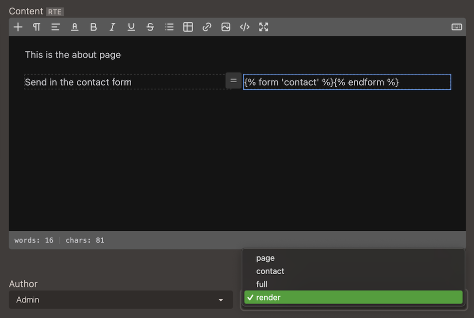
- Add the form tags
{% form 'contact' %}{% endform %}on a page in the editor (Rich Text Editor or Markup editor). - Use the
rendertemplate for the page.
The content for a page is not automatically rendered, but if including liquid filter
| renderto the html output, liquid syntax will be processed.
<section>
    <h1>{{ meta.h1 }}</h1>
    <div>
        {{ page.html | render }}
    </div>
</section>
Creating a contact page
Steps in the video:
- Adding a 2-column layout in the RTE.
- Adding a heading and text to the left column.
- Navigate to
Formsand open the editor for the form. - Adding
Name,Email, andMessagefield as well as a submit button. - Going back to the Contact page view in admin.
- Adding the form tags with the form handle.
- Choosing the
renderpage template. - Previewing the form on the page.
- Changing color scheme in theme settings.
Generated form HTML
When {% form '<handle>' %} and {% endfrom %} tags have no content in between, markup for the form is generated from the setup in admin.
{% form '<handle>' %}{% endform %}
Example code
Generated code for a typical contact form:
<form method="POST" name="contact" id="contact-form" action="/forms/contact">
	<input type="hidden" name="returnUrl" value="/#contact-form">
	<label for="name">Name</label>
	<input type="text" name="name" required="">
	<label for="email">Email</label>
	<input type="email" name="email" required="">
	<label for="phone">Phone</label>
	<input type="tel" name="phone" required="">
	<label for="subject">Subject</label>
	<input type="text" name="subject" required="">
	<label for="message">Message</label>
	<textarea name="message" required="" rows=""></textarea>
	<input type="submit" name="submit" required="" value="Send">
</form>
Custom HTML code in template
If including HTML inside of the {% form %} tag, this code will be used instead of the generated code.
Code for a typical contact form:
{% form 'contact' %}
 <h3>Say hallo!</h3>
   {% if form.errors %}
    <div class="alert alert-error">
     <span>Sorry, looks like something went wrong, please try again.</span>
    </div>
   {% endif %}
   {% if form.success %}
    <div class="alert alert-success">
     <span>Thank you for the message, we will contact you shortly!</span>
    </div>
   {% else %}
    <label class="input {% if form.errors contains 'name' %} input-error{% endif %}">
     <input type="text" name="name" placeholder="Name" required/>
    </label>
    <label class="input {% if form.errors contains 'email' %} input-error{% endif %}">
     <input type="email" name="email" placeholder="Email" required />
    </label>
   <textarea placeholder="Message" name="message"  class="textarea {% if form.errors contains 'message' %} textarea-error{% endif %}" required ></textarea>
   <button type="submit" class="btn btn-primary">Send</button>
  {% endif %}
 </div>
{% endform %}
With
{{ form | print_r }}it is possible to view the form object.