Media queries are usually needed when creating responsive webpages. They are a way to adapt the content to suit the device used to visit the webpage. Global breakpoints are commonly used to define specific device ranges, such as smartphones, tablets or desktop computers.
However, CSS variables cannot be used in media queries, which creates a problem when adjusting a breakpoint, as one has to find all the locations where the breakpoint us used in a media query. The theme settings in Cradle CMS are inserted into the CSS file before it is sent to the browser as they are server-side rendered and can be used as variables in media queries.
What are media queries?
Media queries determine rules for characteristics and type for the device used for viewing the HTML page, such as width.
Example
@media only screen and (max-width: 480px) {.small--one-whole {width: 100%;} }
The CSS code will let the browser know that when the viewport is smaller than 480px in width, elements with the class ".small--one-whole", should follow the rule of having a width of 100%.
Did you know that you can use container queries, it is a way to look at the characteristics of a single HTML element. Read about CSS container queries at mdn
Media types & features
Value examples |
|
|---|---|
Media type |
all, screen and print |
Media feature |
width, height and orientation |
Global breakpoints
It is common to determine global breakpoints for the media queries for a project. This means that all the media queries, and thus CSS follow specific width ranges.
Device type | Width range | Media query example |
|---|---|---|
Smartphone | Up to 500px | |
Tablet | 501px to 800px | |
Laptop | 801px to 2000px | |
XL screen | From 2001px | |
Utilising server-side rendering
The rendering step in Cradle CMS adds in theme settings with liquid, for example {{ settings.breakpointSmall }}, which is a breakpoint in this case, before sending out the files to the browser, and this enables the settings to be used as variables.
@media only screen and (max-width: {{ settings.breakpointSmall }}px) {.small--one-whole {width: 100%;} }
Example of adding in a theme setting
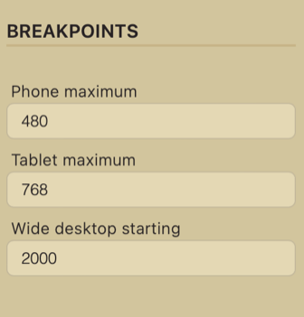
It is possible to create theme settings for the breakpoints, which can be conveniently changed in the theme editor.
Theme settings are defined in a JSON format: Go to guide on theme settings in Cradle CMS
Example of theme settings for breakpoints
{
    "key": "breakpointHeading",
    "caption": "Breakpoints",
    "type": "header"
},
{
    "key": "breakpointSmall",
    "caption": "Phone maximum",
    "type": "text"
},
{
    "key": "breakpointMedium",
    "caption": "Tablet maximum",
    "type": "text"
},
{
    "key": "breakpointLarge",
    "caption": "Wide desktop starting",
    "type": "text"
}
Output

Calculations with Liquid filters
Liquid filters can calculate the additional breakpoints needed in the theme, in this case with the addition filter | plus
min-width: {{ settings.breakpointSmall | plus: 1 }}px)Liquid templating contains several filters: A complete list of Liquid filters in Cradle CMS.
