Intro
Webpages are built wtih HTML, CSS and JS. In Cradle CMS the templating language, to add in dynamic content and logic, is Liquid.
If you are new to web development progressive enhancement is a good strategy to utelize. It puts emphasis on web content and HTML first, continues with CSS for styles and layout and in a final step functionality is added with JS. The strategy creates robust websites and focuses with getting the most important parts right first, it is also the easist way to create failproof and performant solutions.
| Language | Description | Example |
|---|---|---|
| HTML | Hyper text markup language - the basis of the page which holds the content | <div>, <p> and <header> |
| CSS | Cascading Style Sheet - dictates the layout and styles | color: red;, display: grid; and height: 100%;
|
| JS | javascript - adds in the functionality |
HTML - the basics
The HTML elements are of different types depending what they are used for, for example: sectional blocks, content or inline elements.
It is advisable to use semantic markup whenever possible, in short this means to use html-elements that describe the use, for example a <article> element compared to <div> element. The most commonly used html elements for creating semantic markup:
<article>, <aside>, <figcaption>, <figure>, <footer>, <header>, <main>, <nav>, <section> and <time>Reference: HTML element reference - Mdn web docs
Sectional blocks
Sectional HTML blocks creates sections of the page to place content in and by using HTML elements with semantical meaning, such as, <header>, <nav> and <aside>, machines will have an easier time to understand the structure and content of the site.
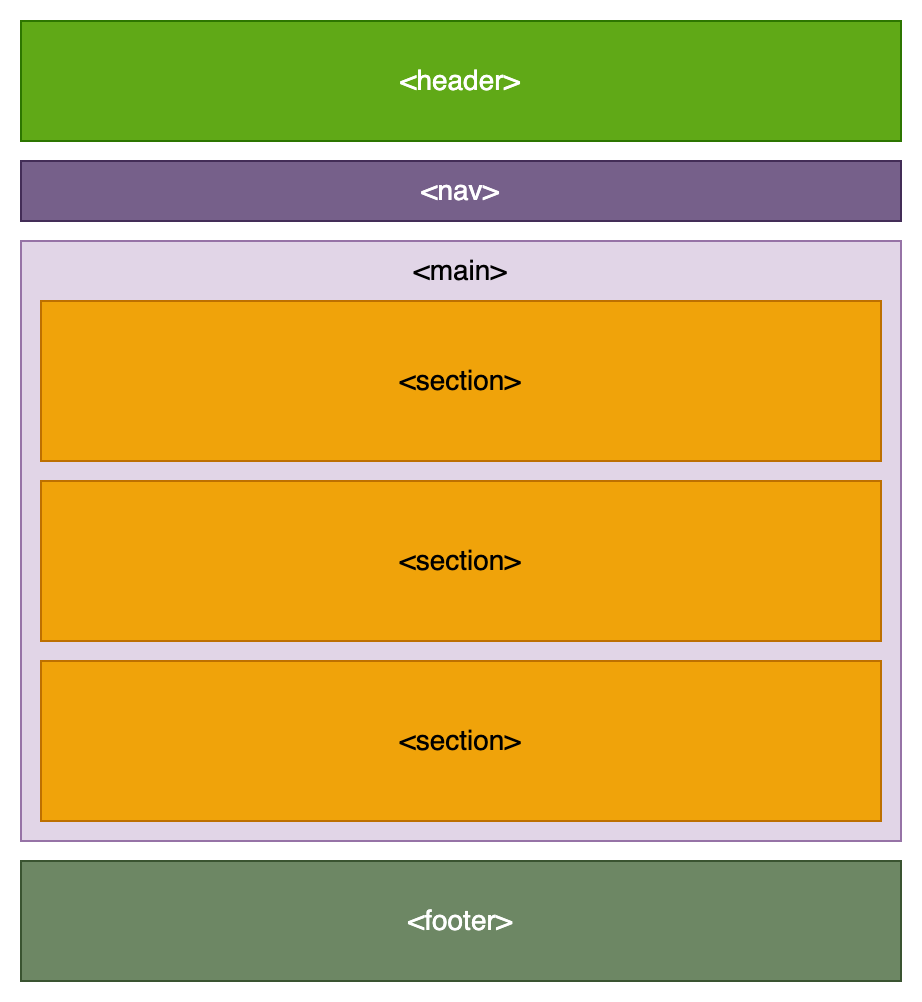
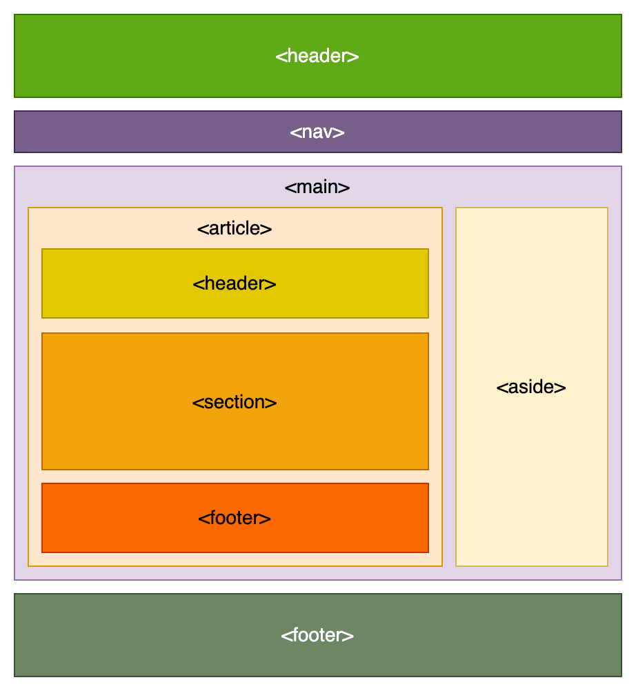
HTML document structure
A barebone main layout-file, theme.liquid, for a site using Cradle CMS. More themes can be found on Github page for Cradle CMS.
<!DOCTYPE html>
<html>
    <head>
        <meta charset="utf-8" />
        <title>
        	{{ site.name }} {% if meta.title != blank and meta.title != site.name %} | {{meta.title}}{% endif %}
        </title>
        <meta name="description" content="{{ metaDescription | escape }}" />
        <meta name="keywords" content="{{ metaKeywords | escape }}" />
        <link rel="canonical" href="{{ canonicalUrl }}" />
        <link rel="stylesheet" type="text/css" href="{{ 'site.css.liquid' | asset_url }}"
    </head>
    <body id="{{ meta.title | handle }}" class="template-{{ template | replace: '.', ' ' | split: ' ' | first | handle }}">
        <header>
            <h1>{{ site.name }}</h1>
        </header>
        <main>
        	{{ contentForLayout }}
        </main>
        <footer>
            <p>Copyright © {{ site.name }}</p>
        </footer>
    </body>
</html>
Inline elements
Inline elements are HTML elements used in the flow of text, such as for bold and italics. These are usually added by the body text editor, if one builds the site with a CMS.
Element attributions
Most commonly used are classnames and ids.
CSS - styles and layout
Modern CSS in combination with HTML handles much of the functionality for website behaviour, layout and styling but it is important to keep track of how well specific CSS and HTML features are supported by different browsers, Can I use? provides browser support tables for checking up.
It is common practise to include a CSS framework fo webprojects, they come in different flavours.
Styles
Styles are usually gathered in a CSS-file, but can also be included in the HTML document within <style> tags or in the element with as an attribute.
Commonly styles are added for an element type, id or classname.
Layout styling
All HTML elements will have a default styling for the flow layout and the layout of the children.
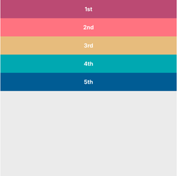
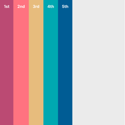
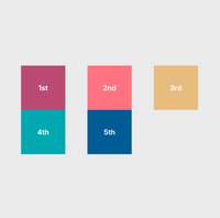
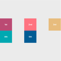
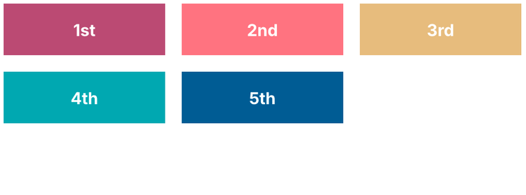
Example with display types
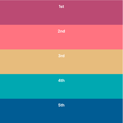
The following HTML, a section with five divs, has default display type of block. Changing the display type to flex or grid will change the layout.
<section class="box">
    <div class="small-box" style="background-color: #c05780;"><p>1st</p></div>
    <div class="small-box" style="background-color: #ff828b;"><p>2nd</p></div>
    <div class="small-box" style="background-color: #e7c582;"><p>3rd</p></div>
    <div class="small-box" style="background-color: #00b0ba;"><p>4th</p></div>
    <div class="small-box" style="background-color: #0065a2;"><p>5th</p></div>
</section>
display: block; /* default */
display: flex;
display: grid;
Flexbox resources
- CSS-tricks: CSS Flexbox Layout Guide
- Josh Corneau: An Interactive Guide to Flexbox
- Tobias Ahlin Bjerrome: Common CSS Flexbox Layout Patterns with Example Code
Placing content horizontally and vertically
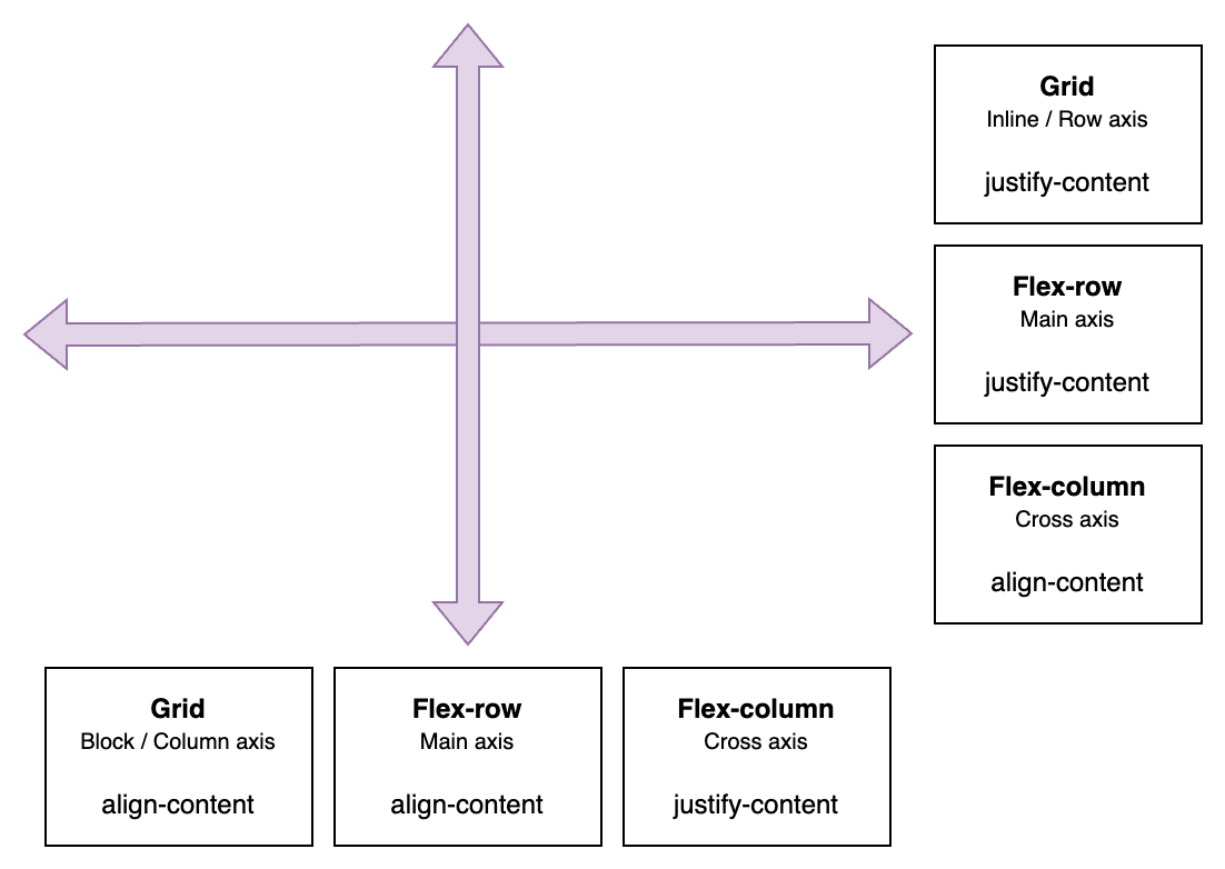
Property values |
|---|
start, end, center, space-evenly, space-around, space-between, strech |
Horizonally placing content
| Display type | Axis name | Property | Example |
|---|---|---|---|
| Grid | Inline / Row axis | justify-content |
|
| Flex-row | Main axis | justify-content |
|
| Flex-column | Cross axis | align-content |
|
Verically placing content
| Display type | Axis name | Property | Example |
|---|---|---|---|
| Grid | Block / Column axis | align-content |
|
| Flex-row | Cross axis | align-content |
|
| Flex-column | Main axis | justify-content |
|
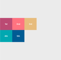
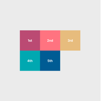
Horizontally placing content in display: grid;
With set width and height on the children
display: grid;
grid-template-columns: 100px 100px 100px;
grid-auto-rows: 100px;
justify-content: start /*example*/;
align-content: center;
justify-content: start;
justify-content: center;
justify-content: space-evenly;
justify-content: space-between;
Responsive grid with display: grid;
.grid-container {
  display: grid;
  grid-template-columns: repeat(auto-fit, minmax(min(100%, 8rem), 1fr));
  grid-auto-rows: 50px; /* only needed if the grid items lacks height */
  gap: 1rem; /* usually we want a gap between the grid items */
}
JS - for functionality
Typical functionality that requires javascript:
- AJAX-cart
- Image slider
Website tests
- PageSpeed Insights from Google
- WebPageTest from Catchpoint
References
- Can I use? - Browser support tables
- Mdn webdeveloper guides - One of the most comprehesive and best guides on webstandards
- Codepen - Online community for displaying code snippets for web development.