Intro
Cradle is a server-side rendered (SSR) or server-side generated (SSG) website and e-commerce software. This means that the system utilizes the server for rendering and serves the website as a multipage application (MPA) by default. In Cradle CMS, Liquid is the templating language for adding dynamic content and logic. As the system also outputs objects in JSON-format it is possible to create websites as a single-page applicaion (SPA) or in a hybrid approach mixing in client-side rendering (CSR) when needed.
Websites today need to function well for visitors from various kind of devices and at the same time be accessible for those with disabilities as well as be machine readable for website crawlers from search engines and AI motors. Progressive enhancement is a good strategy to utilize as it is the easiest way to create accessible, failproof, and performant solutions. Progressive enhancement emphasizes web content and HTML first, then continues with CSS for styles and layout, and finally, functionality is added with JS. The strategy creates robust websites and focuses on getting the most important parts right first.
Techniques
| Language | Description | Example |
|---|---|---|
| HTML | Hyper text markup language - the basis of the page which holds the content | <div>, <p> and <header> |
| CSS | Cascading Style Sheet - dictates the layout and styles | color: red;, display: grid; and height: 100%;
|
| JS | JavaScript - adds in more advanced functionality | |
Liquid |
Templating language used in Cradle software |
|
JSON |
Lightweight format for data |
It is important to keep track of how well specific CSS and HTML features are supported by different browsers. Can I use? provides browser support tables.
HTML - the basis
The HTML including content sets the basis of the site and is all that is really needed, even though very few sites today are made with only HTML. The HTML elements are of different types, some that define the structure (sectional blocks), others for including content, and yet others for inline elements (used within the flow of text). The different types of elements will have different default behaviours in the browsers.
Examples of inline elements are such as for adding a link, bold, or italics. Inline elements are commonly added by the body text editor, such as an RTE (rich rext editor) or a Markdown editor. These elements have the default display type inline.
Accessibility is an important part of web development, and the visually impaired visitors using a screen-reader need to relay on the HTML. A way to check how the markup works for someone with a screen reader, without using a screen reader, is to use the terminal browser Lynx.
Main structure and layout
Example of a barebones main layout-file, theme.liquid, for a site using Cradle CMS.
<!DOCTYPE html>
<html>
    <head>
        <meta charset="utf-8" />
        <title>
            {{ site.name }} {% if meta.title != blank and meta.title != site.name %} | {{meta.title}}{% endif %}
        </title>
        <meta name="description" content="{{ metaDescription | escape }}" />
        <meta name="keywords" content="{{ metaKeywords | escape }}" />
        <link rel="canonical" href="{{ canonicalUrl }}" />
        <link rel="stylesheet" type="text/css" href="{{ 'site.css.liquid' | asset_url }}"
    </head>
    <body id="{{ meta.title | handle }}" class="template-{{ template | replace: '.', ' ' | split: ' ' | first | handle }}">
        <header>
            <h1>{{ site.name }}</h1>
        </header>
        <main>
            {{ contentForLayout }}
        </main>
        <footer>
            <p>Copyright © {{ site.name }}</p>
        </footer>
    </body>
</html>
More themes can be found on the GitHub page for Cradle CMS.
Content in <head>
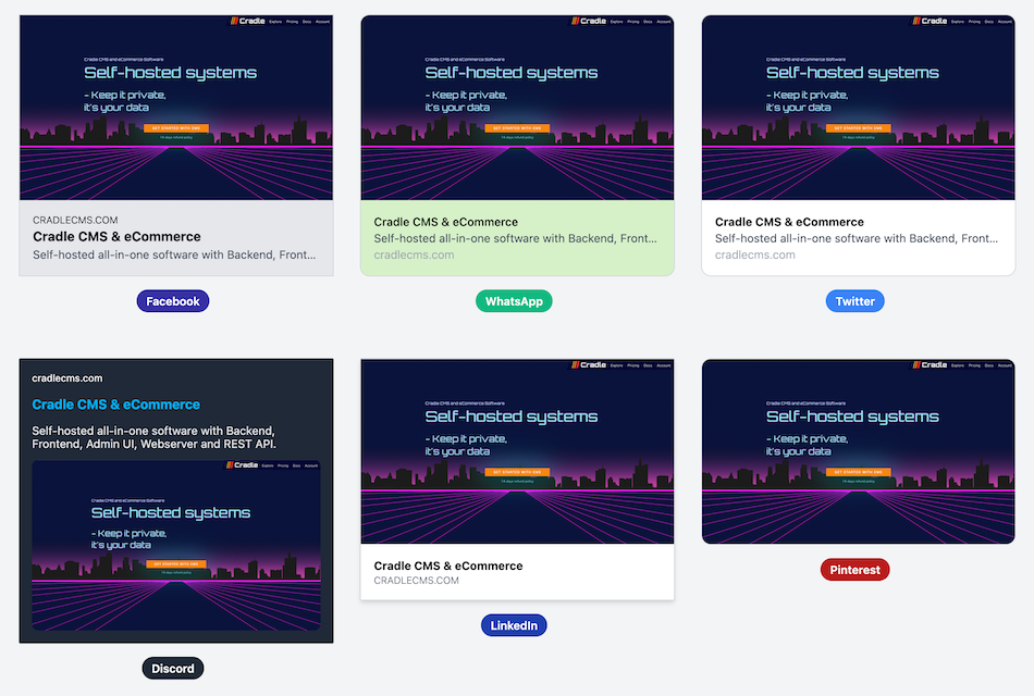
The head element contains meta information about the site, such as titles and descriptions. The site information is formatted to fit many different purposes; the browser will use the title of the site as well as the favicon, search engines use the description, schemas that describe the content will be used by AI-agents, as well as other webscrapers, and Open Graph tags give information to social media when sharing the site there.
Example of open graph tags in <head>
<meta property="og:image" content="{{ site | url }}/cover-full.png" />
<meta property="og:type" content="website" />
<meta property="og:url" content="{{ canonicalUrl }}" />
<meta property="og:title" content="{{ site.meta.title | escape }}" />
<meta property="og:description" content="{{ metaDescription | escape }}" />
<meta property="og:site_name" content="{{ site.meta.title | escape }}" />
- OpenGraph.dev - A tool that shows previews of social media cards
- OpenGraph.xyz - A tool for checking Open Graph information
- The Open Graph protocol - More information on the protocol
Content in <body>
A great deal of web content can be made accessible just by making sure the correct Hypertext Markup Language elements are used for the correct purpose at all times.
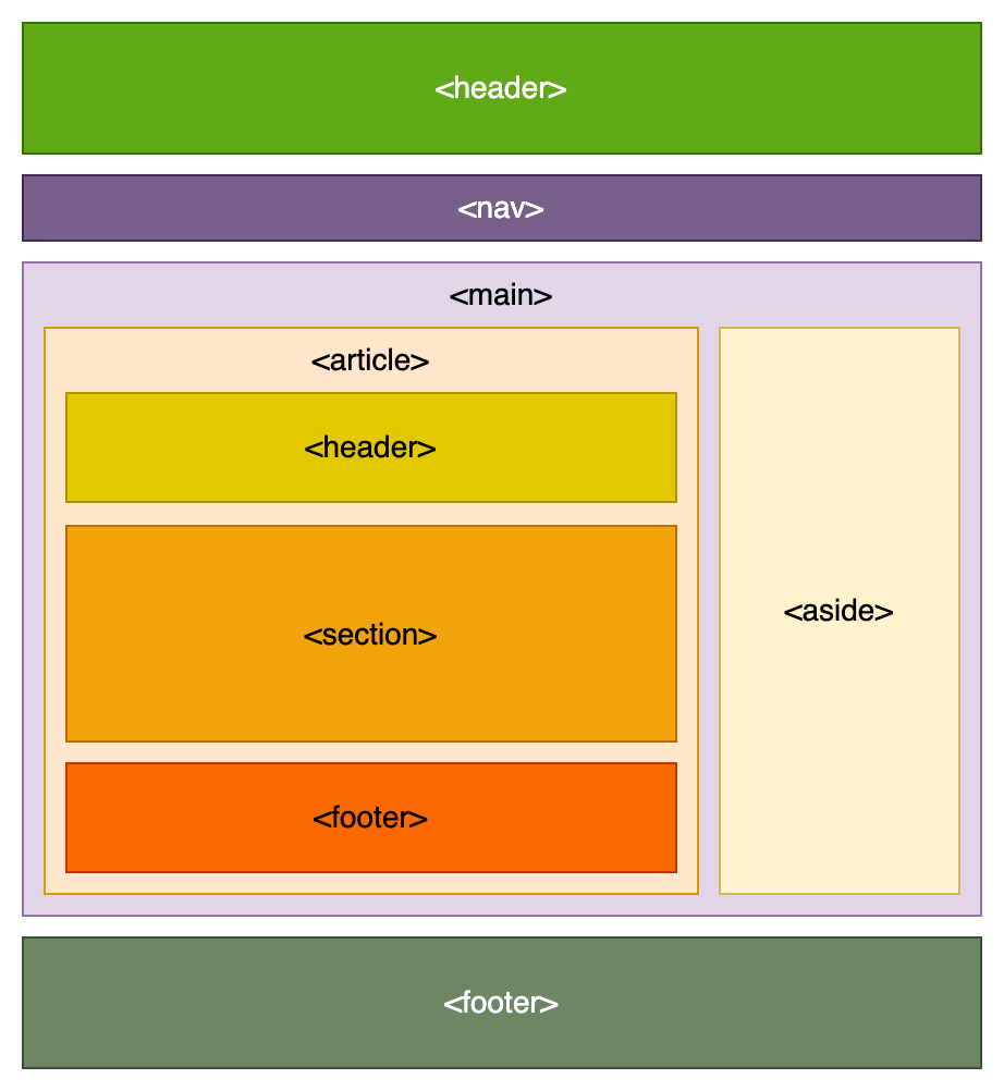
Sectional HTML blocks is used to create sections of the page for content. It is advisable to use semantic markup whenever possible, as machines will have an easier time understanding the structure and content of the site. In short, this means to use HTML elements that describe the use, for example, using an <article> element instead of a <div> element.
Examples of commonly used HTML elements for creating semantic markup:
<article>, <aside>, <figcaption>, <figure>, <footer>, <header>, <main>, <nav>, <section> and <time>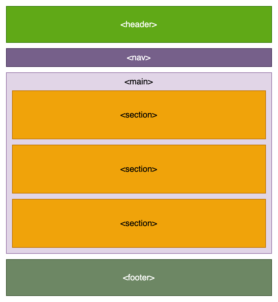
CSS - styles and layout
Today, CSS and even HTML can handle much of the functionality for website behaviour, layout, and styling (colors, backgrounds, and fonts, for example). It is best to add CSS in an external CSS-file, as the local browser cache can be utilized, but it can also be included in the HTML document within <style> tags or in the element with an attribute. Commonly, styles are added for an HTML element type, id or classname.
For more in-depth knowledge here are a few CSS wizards to follow: Ana Tudor, Cris Coyer (founder of CSS-tricks), Josh W. Comeau and Kevin Powell
CSS frameworks
To start off with an initial styling, it is common practise to include a CSS framework in a webproject. They come in different flavours, spanning from classless and only styling the HTML-markup, to include a gridsystem and classes for components of websites or completely class-based for each CSS-rule.
Examples of CSS frameworks
- ok.css - classless framework styling HTML markup
- BeerCSS - combines styling on HTML markup and attributes with classes.
- Tailwind - class-based for CSS rules
- DaisyUI - builds on top of Tailwind, adding themes and classes for components.
Themes with Tailwind CSS and daisyUI
Tailwind CSS is a popular CSS framework and enables styling and layouting without ever leaving the HTML-file. It uses CSS utility classes and in the ens a minified CSS file with only the parts used in included. This means that instead of writing UI component classes and then going to the CSS file to write a set of styles, classes are added to the html tag for each style.
- Theme daisyUI - CMS theme with both Tailwind CSS and daisyUI component CSS framework built ontop of Tailwind.
- Theme eCommerce - eCommerce theme with Tailwind CSS and daisyUI.
- Theme barebone with Tailwind - A great starting point for developing with Tailwind CSS
Important to note is that both Tailwind and daisyUI requires a buildstep to produce the final output for the CSS. The themes for Cradle built with these frameworks contains a developer mode as well as a make file for generation of the final CSS.
All our themes with Tailwind CSS contains a make script for building the CSS file and development mode with CDN access built-in.
Tailwind CSS in HTML for an article card
<div class="p-2 flex flex-col gap-2 bg-zinc-100">
    <img class="h-[200px]" src="{{ article | img_url:0,200 }}" alt="{{ article.image.alt }}"/>
    <div class="flex flex-col justify-between grow">
        <a href="{{ article | url }}">
            <dt><h4 class="font-bold">{{ article.title }}</h4></dt>
            <dd>
                <time class="text-sm mb-2">{{ article.publishAt | date }}</time>
                {{ article.excerpt | truncatewords:20 }}
            </dd>
        </a>
        <p class="mt-2"><a class="p-1 px-2 bg-teal-100 hover:bg-teal-200" href="{{ article | url }}">Read</a></p>
    </div>
</div>
Regular CSS in HTML for the same article card
<div class="article-card">
    <img class="article-card-img" src="{{ article | img_url:0,200 }}" alt="{{ article.image.alt }}"/>
    <div class="article-card-body">
        <a href="{{ article | url }}">
            <dt><h4>{{ article.title }}</h4></dt>
            <dd>
                <time>{{ article.publishAt | date }}</time>
                {{ article.excerpt | truncatewords:20 }}
            </dd>
        </a>
        <p class="article-card-footer"><a class="btn" href="{{ article | url }}">Read</a></p>
    </div>
</div>
In the corresponding CSS file all the styles would be gathered under a class for the UI component, for example the article-card class would contain the following:
.article-card {
    background-color: #fafafa;
    padding: 1rem;
    gap: 1rem;
    display: flex;
    flex-direction: column;
}
When developping with tailwind it is useful to know a bit of CSS basics but being able to add the classes in the HTML speeds up basic styling quite a bit. And in the cases where the UI component is more advanced and the tailwind classes expands, there is no reason not to gather the CSS in a separate CSS file.
Development mode
The themes for Cradle CMS built with Tailwind CSS has a theme setting for development mode, this enables to usage of Tailwind CSS framework CDN when further developing the theme.
Display types
All HTML elements will have a default display type for the flow layout and the layout of the children. But the display type, and thus the flow of the element, can be changed.
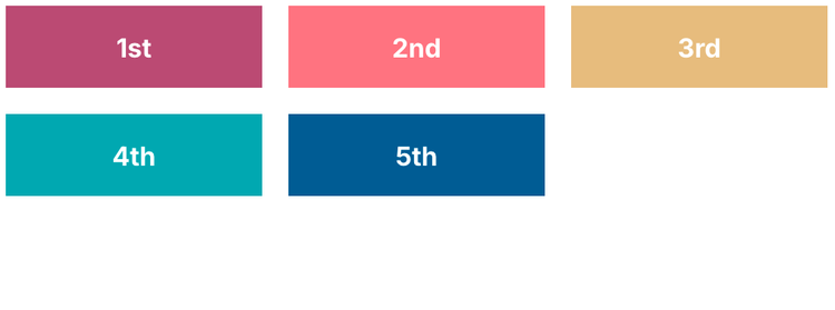
Example with display types
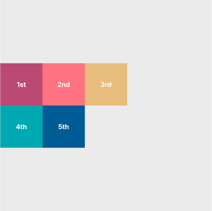
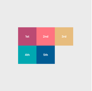
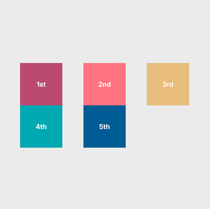
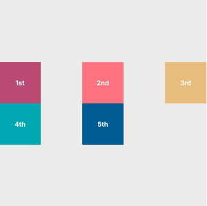
The following HTML, a section with five divs, has default display type of block. Changing the display type to flex or grid will change the layout.
<section class="box">
    <div class="small-box" style="background-color: #c05780;"><p>1st</p></div>
    <div class="small-box" style="background-color: #ff828b;"><p>2nd</p></div>
    <div class="small-box" style="background-color: #e7c582;"><p>3rd</p></div>
    <div class="small-box" style="background-color: #00b0ba;"><p>4th</p></div>
    <div class="small-box" style="background-color: #0065a2;"><p>5th</p></div>
</section>
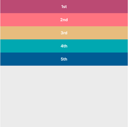
The default behaviour of <div>s in a <div>
display: block;
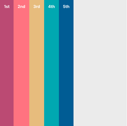
The behaviour of <div>s in a <div> with display: flex;
display: flex;
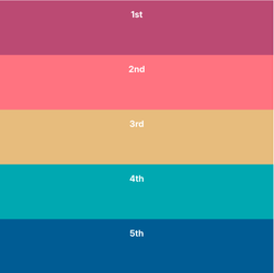
The behaviour of <div>s in a <div> with display: grid;
display: grid;
Flexbox resources
A display type set to flex enables a lot of possibilities, but can at the same time be a bit confusing. The following resources can provide help:
- CSS-tricks: CSS Flexbox Layout Guide
- Josh Corneau: An Interactive Guide to Flexbox
- Tobias Ahlin Bjerrome: Common CSS Flexbox Layout Patterns with Example Code
- Flexbox froggy - play around with flex-box in an interactive demo
Placing content horizontally and vertically
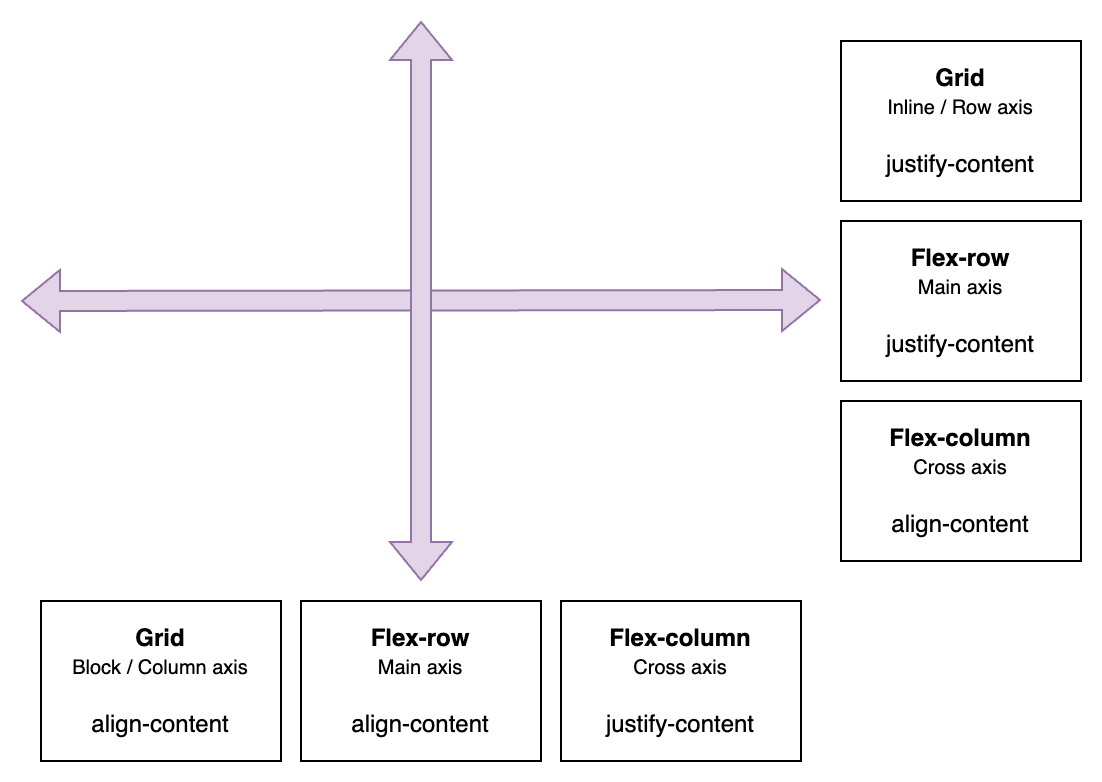
With display types flex and grid, the content bahaviour is styled along x- and y-axes with justify-content/items/self and align-content/items/self, and in the case of display type flex, it is also dependent if the flex-direction is set to flex-row or flex-column.
Property values for align-content and justify-content |
|---|
start, end, center, space-evenly, space-around, space-between, strech |
Horizontally placing content
| Display type | Axis name | Property | Example |
|---|---|---|---|
| Grid | Inline / Row axis | justify-content |
|
| Flex-row | Main axis | justify-content |
|
| Flex-column | Cross axis | align-content |
|
Verically placing content
| Display type | Axis name | Property | Example |
|---|---|---|---|
| Grid | Block / Column axis | align-content |
|
| Flex-row | Cross axis | align-content |
|
| Flex-column | Main axis | justify-content |
|
Horizontally placing content in display: grid;
With a set width and height for the children
display: grid;
grid-template-columns: 100px 100px 100px;
grid-auto-rows: 100px;
justify-content: start /*example*/;
align-content: center;
display: grid;justify-content: start;
display: grid;justify-content: center;
display: grid;justify-content: space-evenly;
display: grid;justify-content: space-between;
Responsive websites
A responsive website adapts to the device visited from.
@media and @container queries
Media queries, @media, are usually needed when creating responsive webpages. They are a way to adapt the content to suit the device used to visit the webpage. Global breakpoints are commonly used to define specific device ranges, such as smartphones, tablets or desktop computers. The container queries, @container, work much the same but is a way to add in responsive behaviour depending on the characteristics of a single HTML element, such as a <div>.
- @media queries - mdn developer documentation
- CSS Media Queries - Cris Coyer, CSS-tricks
- @container queries - mdn developer documentation
What are media queries?
Media queries determine rules for characteristics and type for the device used for viewing the HTML page, such as width.
/* Example of a media query */ @media only screen and (max-width: 480px) {.small--one-whole {width: 100%;} }
The CSS code will let the browser know that when the viewport is smaller than 480px in width, elements with the class ".small--one-whole", should follow the rule of having a width of 100%.
Media |
Values |
Syntax example |
|---|---|---|
Media type |
all, screen and print |
|
Media feature |
width, height, hover and orientation |
|
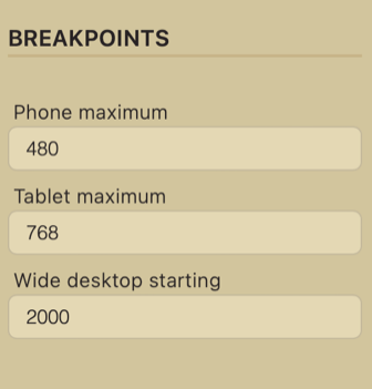
Global breakpoints
It is common to determine global breakpoints for the media queries for a project. This means that all the media queries, and thus CSS follow specific width ranges.
Device type |
Width range |
Media query example |
|---|---|---|
Smartphone |
Up to 500px |
|
Tablet |
501px to 800px |
|
Laptop |
801px to 2000px |
|
XL screen |
From 2001px |
|
However, CSS variables, which usually are very usable, cannot be used in media queries, which creates a problem when adjusting a breakpoint, as one has to find all the locations where the breakpoint is used in a media query.
A way to overcome the cumbersome adjustment of breakpoints is to use theme settings. The rendering step in Cradle CMS adds in theme settings with liquid, for example {{ settings.breakpointSmall }}, before sending out the files to the
browser, and this enables the settings to be used instead of a variables.
/* Example of using a theme setting for the breakpoint in a media query */ @media only screen and (max-width: {{ settings.breakpointSmall }}px) {.small--one-whole {width: 100%;} }
Theme settings are modifiable: Go to guide on working with theme settings in admin or how to modify and build theme settings.
Responsive grid with display: grid;
For a long time a repsonsive grid had to be made with CSS styles for a number of media queries, but with display: grid; it is possible to use a much shorter CSS syntax for the same result.
/* responsive grid without media queries */
.grid-container {
  display: grid;
  grid-template-columns: repeat(auto-fit, minmax(min(100%, 8rem), 1fr));
  grid-auto-rows: 50px; /* only needed if the grid items lacks height */
  gap: 1rem; /* usually we want a gap between the grid items */
}
JS - for functionality
Typical functionality that requires JS:
- AJAX-cart
- Image slider
Website tests
- PageSpeed Insights from Google
- WebPageTest from Catchpoint
- Schema validator: Schema Markup Validator
- Color contrast checker (accessibility compliance): Colour contrast checker
References
- Can I use? - Browser support tables
- Mdn webdeveloper guides - One of the most comprehensive and best guides on webstandards
- Codepen - Online community for displaying code snippets for web development.