
Default theme for eCommerce installations.
All themes have settings for adapting, colors, layout and elements such as the header, footer and first page but they will vary depending on the theme. The code for the themes can be modified and as well as created from scratch.
For latest updates, upload from github: eCommerce theme on github
Color themes
The theme has over 30 color themes to choose from. They are chosen in a drop-down and provides an easy way to adapt to the brand colors as well as change color scheme when needed.



Header
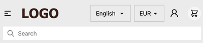
The fully responsive header includes support for logo, navigation, autosearch, language selector, currency selector, account button, and cart button.
| Name | Description |
|---|---|
| Logo | The theme uses logos added in Site settings |
| Navigation | Build navigation under Navigation |
| Autosearch | Uses the built-in search functionality in Cradle |
| Language selector | Shown if more than one language is published under Languages |
| Currency selector | Shown if there are more than one currency active in Shop settings |
| Customer accounts link | Toggle on and off in theme settings |
| Cart | Drawer cart or redirect as options |
A note for theme developers: Autosearch, language selector, currency selectors and many more are written as stand-alone components and can be found in Github cradle-component

Homepage
Hero section
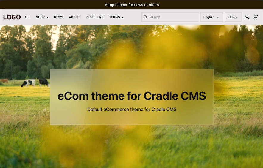
An optional hero section with adjustable height, background image or video and A card with title, description, image, and button.
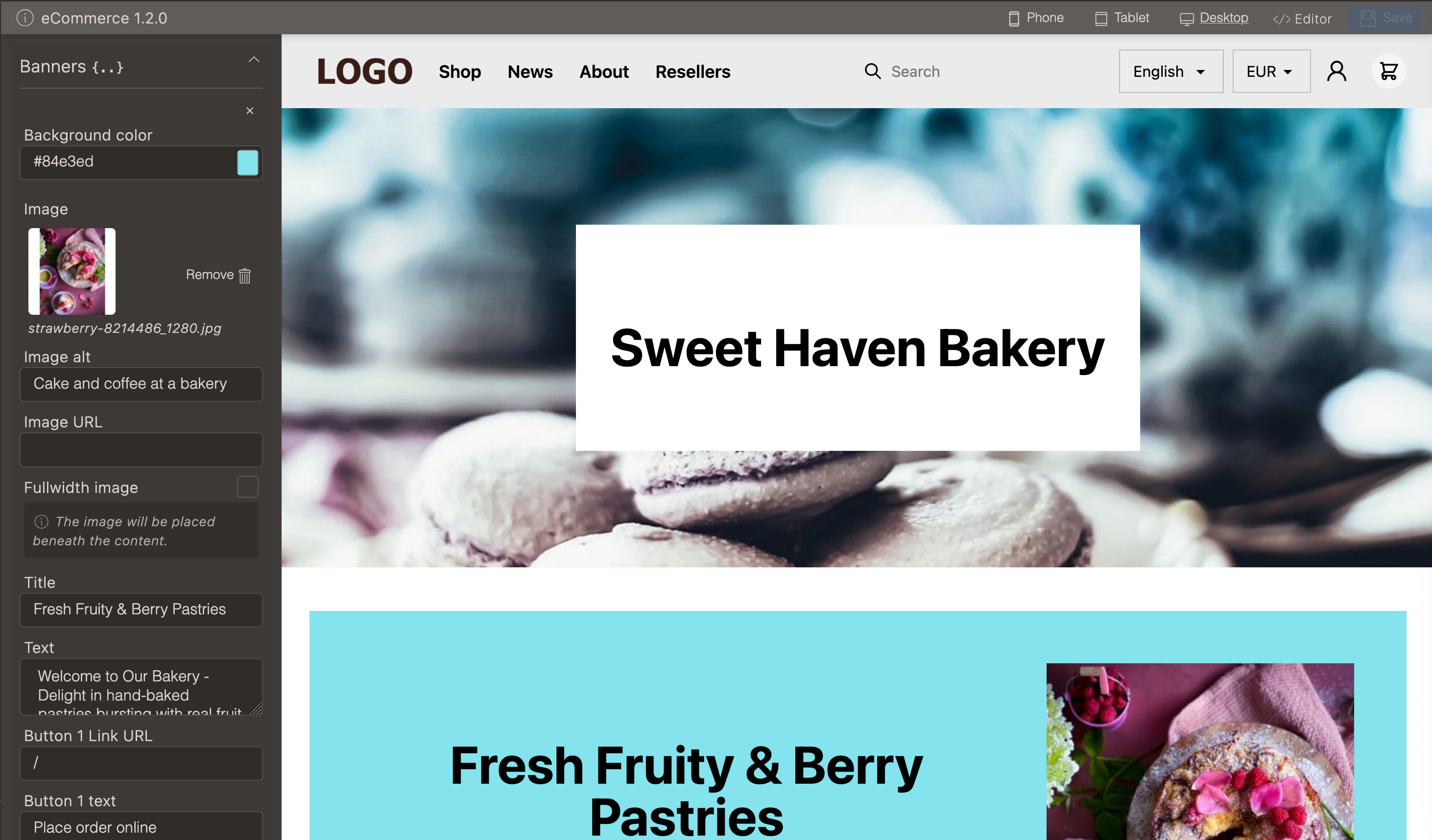
Banners
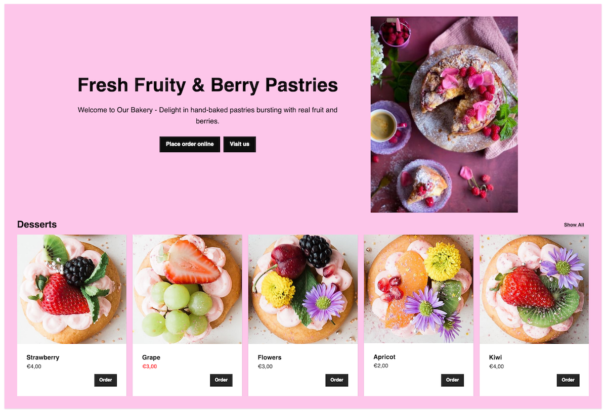
- Title and descriptive text
- Up to two links
- Image (displayed next to the text or in full-width beneath)
- Collection
- Background color
Collection and links
Fullwidth image

Footer
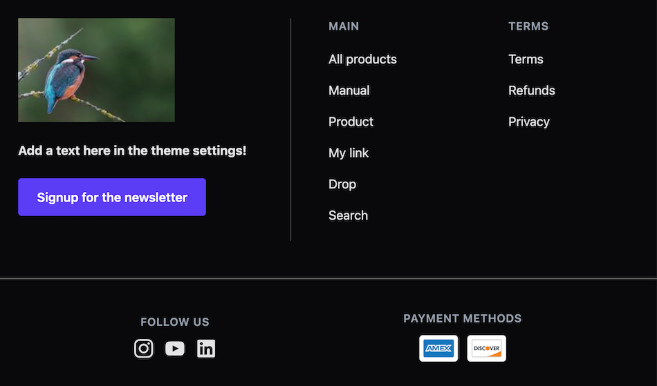
The footer is built to adapt to the provided information.
- Logo or image
- Descriptive text
- Custom button
- Navigation link lists
- Social media links
- Payment methods
Theme customizations
There is full access to the theme code in the theme editor, but altering the theme makes updates harder to follow.
Include custom script file
Add in scripts, commonly needed when using 3rd party tools, and still be able to use the update function.
- Go to theme files editor and add in a file in assets called
custom.js - Add the code into the file, remove any
<script>tags, remember to look for the closing tag as well</script>. - Go to theme settings > global and tick include custom script file
Include custom meta data
- Go to theme files editor and add in a file in assets called
customMeta.liquid - Add the meta data into the file.
- Go to theme settings > global and tick include custom meta file